
Notice
Recent Posts
Recent Comments
Link
| 일 | 월 | 화 | 수 | 목 | 금 | 토 |
|---|---|---|---|---|---|---|
| 1 | 2 | 3 | 4 | 5 | ||
| 6 | 7 | 8 | 9 | 10 | 11 | 12 |
| 13 | 14 | 15 | 16 | 17 | 18 | 19 |
| 20 | 21 | 22 | 23 | 24 | 25 | 26 |
| 27 | 28 | 29 | 30 |
Tags
- queue
- NumPy
- 백준
- type hint
- Stack
- String Method
- javascript
- Algorithm
- 알고리즘
- pandas
- 코딩테스트
- aws jupyter notebook
- 파이썬
- python
- Join
- 프로그래머스
- 가상환경
- dataframe
- 알고리즘스터디
- Selenium
- 정보처리기사 c언어
- Matplotlib
- openCV
- 자료구조
- programmers
- MySQL
- 노마드코딩
- 데이터시각화
- 알고리즘 스터디
- 선그래프
Archives
- Today
- Total
목록plot 그리기 (1)
조금씩 꾸준히 완성을 향해
 [Seaborn] 다양한 그래프 그리기3 (violinplot, jointplot, FacetGrid, pairplot)
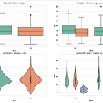
박스플롯 vs 바이올린 플롯 boxplot(): 범주형 데이터 분포와 주요 통계 지표 함께 제공 -> 분산 파악 어려움 violinplot(): 커널 밀도 함수 그래프를 y축 방향에 추가 # 그래프 객체 생성(figure에 4개의 서브플롯을 생성) fig = plt.figure(figsize=(15,10)) ax1 = fig.add_subplot(2,2,1) ax2 = fig.add_subplot(2,2,2) ax3 = fig.add_subplot(2,2,3) ax4 = fig.add_subplot(2,2,4) # 그래프 그리기 sns.boxplot(x='alive', y='age', palette='Set2', data=titanic, ax=ax1) sns.boxplot(x='alive', y='age..
Python/데이터 시각화
2022. 10. 1. 23:24